Elements / Design System
A modular React design system with 22 accessible, typed UI components.
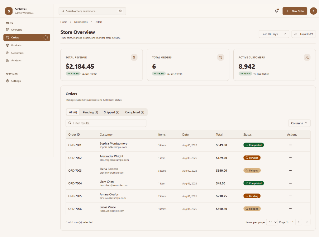
Overview
I built Elements to solve a problem I kept running into across projects: rebuilding common UI patterns from scratch (like modals, data tables, and search command menus) with slightly different styles, keyboard bugs, and state logic every single time.
Elements provides a unified set of 22 production-grade interface components built on top of React 19, TypeScript, Tailwind CSS v4, and Radix UI primitives. Every component comes with native dark mode support, micro-interactions, full keyboard navigation, and WAI-ARIA compliance out of the box.
By pairing a CSS-first token pipeline with Storybook visual documentation, I created a reliable component foundation that lets you drop production-ready UI directly into applications without wrestling with accessibility or layout bugs.
The Problem
When building features independently, interface inconsistencies creep in quickly: inputs look slightly different, focus management breaks, and recreating complex components like paginated data tables or multi-file uploaders consumes hours of engineering time. Additionally, components were often strictly controlled (requiring verbose state boilerplate) or strictly uncontrolled (failing when parent forms needed to reset state dynamically).
The Solution
I designed Elements around CSS-first design tokens and headless accessibility primitives. Using CSS custom properties for spacing and colors makes theming and dark mode straightforward across applications. Wrapping Radix UI primitives handles focus trapping, ARIA tags, and portal rendering safely, while a dual state model allows components to work seamlessly in both simple and complex form workflows.
Key Features
Built-in column sorting, global text search filtering, column visibility toggles, and smooth pagination for structured dataset management.
Modal and inline search dialogs with automated focus management, keyboard arrow navigation, action filtering, and shortcut visual hints.
Drag-and-drop file upload area with format validation, upload progress indicators, file rejection feedback, and thumbnail image previews.
Verification code entry featuring auto-advancing focus, backspace retraction, multi-digit paste distribution, and character sanitation.
Accessible modal dialogs, popovers, dropdown menus, and tooltips rendering safely in DOM portals with focus locks and Escape key dismissal.
Form inputs paired with label alignment, helper text, error state messaging, and ARIA attributes for accessible form feedback.
Technical Decisions & Architecture
Tailwind v4 CSS-First Token Pipeline
Decision: Adopted Tailwind CSS v4's native CSS custom property configuration rather than JavaScript configuration files.
Why: Defining design tokens in pure CSS eliminates runtime JS style calculations and allows theme customization without touching component code.
Standardized Controllable State Architecture
Decision: Implemented a dual state management pattern across interactive components to support both controlled and uncontrolled modes.
Why: Requiring explicit state handlers for simple inputs creates unnecessary boilerplate, while strictly uncontrolled components fail when parent forms reset state.
Leveraging Headless Accessibility Primitives
Decision: Built overlay and form controls on top of Radix UI primitives instead of writing custom DOM event listeners.
Why: Manually managing focus restoration, screen reader announcements, and portal mounting across browsers is notoriously error-prone.
Technical Challenges & Key Learnings
Managing Keyboard Traps & Focus in Multi-Slot Inputs
The Problem: Coordinating keyboard focus across separate input elements while handling paste events, backspace navigation, and character filtering.
Why it was difficult: Standard forms move focus on Tab, but users expect Arrow keys, backspacing over empty slots, and pasting full codes to shift focus automatically without breaking form submissions.
How it was solved: Developed an event delegation controller that intercepts keyboard events, calculates target slot indices dynamically, sanitizes incoming pasted strings, and updates field focus programmatically.
Testing Portal-Rendered Overlays in Automated Suites
The Problem: Unit testing dropdown menus, tooltips, and modals frequently produced false positives because portal elements mount outside the primary component tree.
Why it was difficult: Simulated DOM environments fail to accurately reflect layout bounds, focus trapping, or portal z-index stacking.
How it was solved: Established a dual-layer testing setup: Vitest unit tests verify state transitions, while automated Playwright browser tests run against Storybook stories to validate focus trapping and visual rendering.